


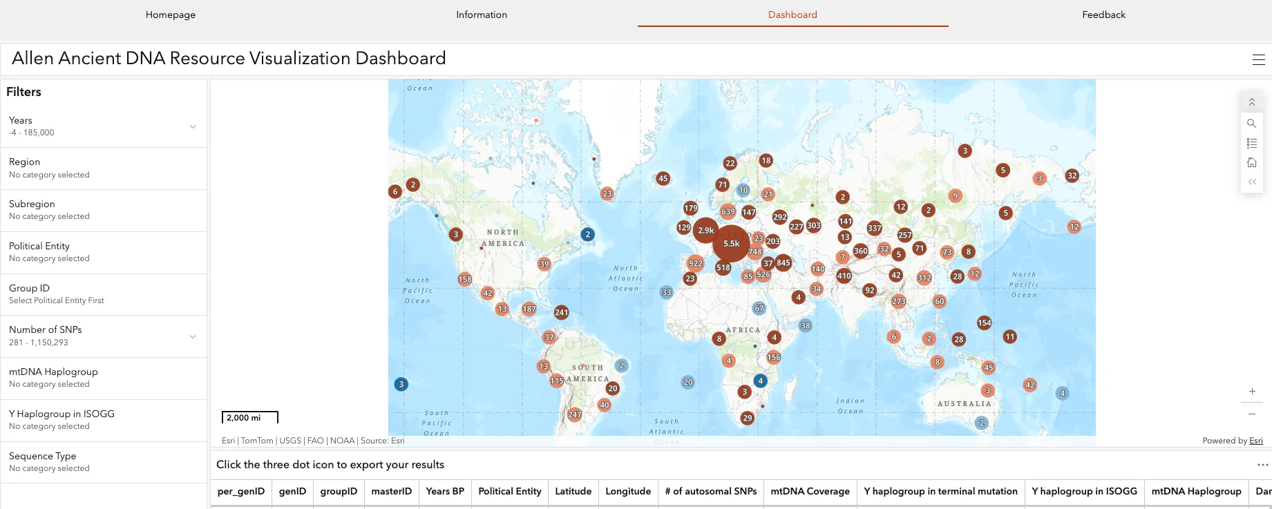
For most of the last decade, the world’s most important ancient DNA database was really just a giant text file. Say you wanted to see which prehistoric humans scientists had sequenced in Bronze Age Iberia. You had to download a multi-megabyte annotation file. Then you opened it in a scripting language and filtered tens of thousands of rows by hand. That barrier quietly kept an extraordinary resource behind a wall of coding skill. A small team at the University of Richmond just tore that wall down. In its place they built something almost anyone can use: a clickable map of humanity’s genetic past.
The tool goes by the name AADR Visualizer, and it does something deceptively simple. It takes the Allen Ancient DNA Resource (AADR) and plots every ancient individual on an interactive world map. The AADR is the reference dataset behind a huge share of published research on human population history. Here you install no software, write no code, and pay nothing. For a field that generated headlines for years while staying inaccessible to non-specialists, that shift matters more than it sounds.
What the AADR Visualizer, an ancient DNA database tool, actually is
The Visualizer launched in a peer-reviewed Bioinformatics Advances paper. It runs as a public, web-based interface on ArcGIS Online. The current version maps 13,571 ancient humans from AADR Dataverse 9.0 (release v62.0, dated September 16, 2024). Each dot marks a real person who lived, died, and later entered a sequencing lab. And each one carries a full dossier of metadata.
A team at the University of Richmond built it. Biology professor Melinda Yang and geography professor Stephanie Spera led the work. Beth Zizzamia of the university’s Spatial Analysis Lab provided technical support, and two undergraduates, Flora Yi and Elliot Delroba, contributed. The university’s announcement framed the goal plainly. The team wanted to make an “incredibly rich dataset” visually accessible to a wide audience, “not just specialists.” That framing matters, and it isn’t only marketing language. We’ll come back to why.
Architecturally, the project punches above its weight. A Python ETL pipeline drives it, and the team published that pipeline openly on GitHub. The pipeline pulls the AADR’s 35-column annotation file, cleans and subsets it, and standardizes country names against the ISO-3166 list. It then pushes the result into an ArcGIS hosted feature layer. That layer feeds a web map. A dashboard wraps the map for filtering. An ArcGIS “Experience” website then houses the dashboard, an information page, and a feedback form. In short, it is a genomics dataset rebuilt with a geographer’s tools.
The problem this ancient DNA database was built to solve
Ancient DNA research has exploded since 2010. The AADR crossed 10,000 sequenced individuals at the end of 2022, and it keeps growing. Roughly 50 papers’ worth of new data arrive each year. That abundance created a paradox the Richmond team names directly. With so many individuals available, simply deciding who to include in a study became hard.
Sample choice is not casual work. When and where a person lived determines whether they fit a research question. The sequencing method and the amount of recovered DNA dictate which analyses hold up. Closely related individuals often have to go, because kinship biases demographic statistics. Answering all of that from a raw file demands fluency in a computational language. The Visualizer removes exactly that skill from the equation. Sliders and drop-down menus now do the filtering, so a researcher can scope a dataset in minutes.
What’s inside this ancient DNA database: the data and the filters
I spent time working inside the tool. The first impression holds up: it is genuinely integrative and easy to use. The map does the heavy lifting, and the metadata stays one click away. Click a cluster or a point. The matching individuals surface at once, in a pop-up and in a linked table below.
Metadata available for each individual
A structured record sits behind each mapped person. You can view and export these fields:
- Genetic ID, Group ID, and Master ID (the last links samples that may share one individual)
- Years BP (dating) and full date range, including calibrated radiocarbon information
- Political entity, latitude, and longitude
- Number of autosomal SNPs and mtDNA coverage
- Y-chromosome haplogroup in terminal-mutation notation and in ISOGG notation
- mtDNA haplogroup and DNA damage rate
- Library type, assessment, repository, and sequence type
- Publication DOI link and free-text notes
Filters that scope the map
The left sidebar exposes a diverse, responsive set of filters:
- Years (a sliding scale over radiocarbon dating)
- Region and subregion
- Political entity (country)
- Group ID
- Number of SNPs
- mtDNA haplogroup
- Y haplogroup in ISOGG notation
- Sequence type
The map uses clustering symbology. At a global zoom, nearby individuals collapse into one circle. The circle’s size shows how many people it holds. Its color encodes the average number of autosomal SNPs. Dark blue marks sparse data under 100,000; brown marks the richest, over 500,000. As you zoom in, clusters break apart until each point marks a single set of coordinates. You can download whatever sits on screen after filtering as a CSV. That export is where the tool turns useful for real research, not just browsing.
Who actually uses it — and why the Group ID feature matters
The obvious audience is population geneticists and archaeogeneticists scoping new studies. But the smartest design choice speaks to how that work really happens. Many core methods — tools like ADMIXTOOLS — don’t analyze individuals in isolation. They pool genetically similar people into groups to gain statistical power. So the number of groups in a region often matters more than the number of individuals. The Visualizer’s Group ID search reflects that insider knowledge, not just a data-dump on a map.
The second audience is students. The authors built the tool for undergraduate classrooms too. There it can teach human prehistory, migration, and genomics without any coding. For educators who build lessons around open resources, it slots in alongside other free collections in our science databases section. Its archaeology-meets-data character echoes resources like the Israel National Archaeological Database and the historically minded China Biographical Database.
How it compares to other tools
The Visualizer is not the only attempt to map this data. Its one real predecessor is DORA (Data Overlays for Research in Archaeogenomics). The trade-off between them is instructive. DORA includes some genetic analysis features that the Visualizer leaves out. In exchange, the Visualizer offers richer filtering, its Group ID emphasis, and fuller pop-ups. DORA shows metadata for only one individual per location. The Visualizer shows every individual who shares a coordinate. Its downloadable table also carries more original metadata, including uniparental haplogroups and full radiocarbon dates. The design philosophy is clear: less analytical machinery, more accessible exploration.
The ancient DNA database limitations the marketing won’t mention
A responsible look at any ancient DNA database has to cover what it gets wrong. To the team’s credit, the paper owns its own seams. Building the map required coordinates that the underlying data didn’t always provide cleanly. Along the way, the authors found and fixed 60 individuals by hand. Twenty-seven lacked DOIs, and 33 lacked coordinates. A check against ArcGIS country borders flagged 146 individuals mapped into water bodies and 56 mapped to the wrong country. Five carried outright typos in coordinates from the original papers. The team left most of these unadjusted, since the points still fell within or near the right country. That call is defensible. Still, a clean-looking dot can rest on approximate or reconstructed geography.
The deeper limit is inherited, not introduced. The Visualizer is only as complete and current as the AADR beneath it. The AADR’s own creator, Harvard geneticist David Reich, calls it “an opinionated data set.” By his own account, it is “not a comprehensive version of all of the data” ever published. It reflects curatorial choices about what to include and how to standardize it. Anyone who treats the map as the whole of ancient human DNA would overread it.
A funding cloud over the whole enterprise
Here is the part that turns a product review into a story worth watching. The Visualizer sits on a database whose future looks genuinely uncertain. The Harvard Crimson reported the problem in October 2025. The AADR’s main funding — an eight-year grant from the Paul G. Allen Family Foundation — expired in September 2025. The Reich Lab has no committed source to replace it. A renewal proposal to the National Institutes of Health reportedly earned an “excellent score.” But reductions in federal awards to Harvard have stalled it. Researchers have downloaded this resource more than 67,000 times, at over 200 downloads a day. Its steward says plainly that he cannot sustain it “for more than a short term” without new money.
That fragility is easy to miss as you click around a polished map. It also reframes the transparency value of the tool. Free, open, downloadable exports are not just a convenience — they are a hedge. Every researcher who pulls a filtered CSV holds a copy of data that may not always stay centrally maintained. It shows why open, publicly mirrored resources matter. We track many of them in our directory of free and open databases.
Where it fits in real life
Strip away the specialist framing, and the practical uses run wide. A graduate student can scope a dissertation dataset before writing any analysis code. An instructor can build a class exercise on Neolithic migration in an afternoon. A science journalist can fact-check where and when a lab sequenced a population. A curious reader with no genetics background can zoom into their own region and see who came before. The common thread is simple: a resource that once demanded a programming language now asks only for a browser.
The AADR Visualizer is a modest tool from a small team, and it doesn’t pretend otherwise. But it models a pattern worth watching. It takes a rich, forbidding dataset and makes it legible to people who would never open a terminal. Whether the database underneath survives its funding crisis is a separate, more worrying question. The map, at least, has already done its job. It shows what accessibility can look like.
Sources
- AADR Visualizer — Interactive dashboard (University of Richmond, ArcGIS Online)
- Yang et al., “The AADR Visualizer: an ArcGIS online visualizer for ancient human DNA from the Allen Ancient DNA Resource,” Bioinformatics Advances (2025)
- University of Richmond news release announcing the AADR Visualizer
- Allen Ancient DNA Resource (AADR), Reich Lab, Harvard Medical School
- Mallick et al., “The Allen Ancient DNA Resource (AADR): a curated compendium of ancient human genomes,” Scientific Data (2024)
- “Ancient DNA Database Faces Uncertain Future after Funding Expires,” The Harvard Crimson (Oct. 23, 2025)
- AADR Visualizer metadata ETL pipeline (GitHub, MYangLab)
This article was created with AI assistance and reviewed by a human editor.

